Thursday, April 4, 2013

Correlation analysis: Generating correlation matrix between many variables in Excel

In previous post about regression analysis we talked about Data analysis Pak in Excel. This can be used to calculate correlation between n number of variables. The process is simple:

From tools, click data analysis, then select correlation.


Now we need to specify the input range and output range (may be new worksheet or workbook or a region where the correlation matrix will be pasted ). 


Sometime you might want to see the matrix as heatmap, you can conditionally color the matrix, so that you can identify high and low correlation, just to make sense.


Principal Component analysis in Excel using Rexcel

See the related posts on RExcel (for basicExcel 2003 and Excel 2007) for basic information. In these posts we have discussed how we can install and operate in Rexcel (R integrated within Excel)- there is no need for any scripting skills, it is menu driven ! 

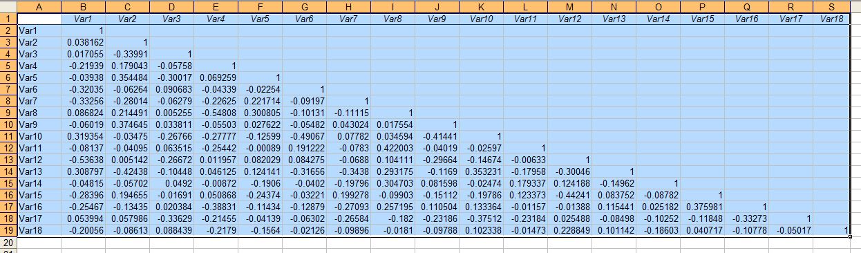
Here is data, we want to load it to R data, putting to R dataframe. See the above mentioned posts for details.


After creating dataset, under statistics menu, select dimension analysis find "principal component analysis". Then the following box will appear where we need to add variables need to be analysis, highlight them by clicking them. We might want to see screeplot and we want to add principal component to data set so that we can plot it later. If we checked this box, it will show a box where we can specify how many components we want to retain.


The output also plotted in output window. You can copy and paste in text editor and load it in excel too. Other way would get it from R dataset, by put data to sheet. The scree plot will appear in R graphical device. 
  
We can also plot the pricipal components (usually PC1 and PC2 or 3D - PC1, PC2, and PC3). Plot scatter plot between components, go to graphs then to scatter plot matrix. Let's say we are interested in plotting PC1, PC2, PC3 and PC4. 


We might want to plot 3D scatter plot for first three components, go to graphs and then 3D graphs, then 3D scatter plot. Then select the PC variables to plot:


For plotting from Excel read my another blog: 


Regression analysis in Excel

Regression analysis is one of common need for data analysis. For this we need to install data analysis add in from Microsoft. If you are using first, follow the steps of installation (see the link). In Microsoft Excel 2003, this under tools. Click add ins. Then you can see list of add ins installed. Check data analysis and data analysis VBA.


With Data Analysis ToolPak installed we will be able to see Data analysis function under tool menu in Excel 2003. Click the data analysis you can select the regression analysis. Select regression analysis. 


Now we need to specify range of X and Y values and output area (most preferably in new worksheet). Specify input Y range, X range. For dignosis of regression model we will like to see residual plots and also normal probability plot. Check the appropriate boxes.   


Now OK will take you all the output needed in regression analysis:


You can change the plot to look them nicer (if you need to present).

Quick method without need of data analysis VBA: 

We can also get regression plot and equation with R square, using just scatter plot and adding the line to the plot and display linear regression equation. Such plot is useful in presentation of results.


For plotting from Excel read my another blog: