From tools, click data analysis, then select correlation.

Now we need to specify the input range and output range (may be new worksheet or workbook or a region where the correlation matrix will be pasted ).

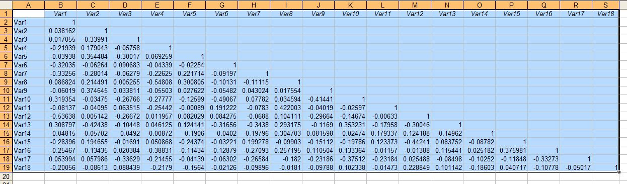
Sometime you might want to see the matrix as heatmap, you can conditionally color the matrix, so that you can identify high and low correlation, just to make sense.


No comments:
Post a Comment
Note: Only a member of this blog may post a comment.